Typography — Headings
Display — Graphic Design That Speaks Volumes
var(--h-display)
Display — Graphic Design That Speaks Volumes
var(--h1)
Display — Graphic Design That Speaks Volumes
var(--h2)
Display — Graphic Design That Speaks Volumes
var(--h3)
Display — Graphic Design That Speaks Volumes
var(--h4)
Typography — Text
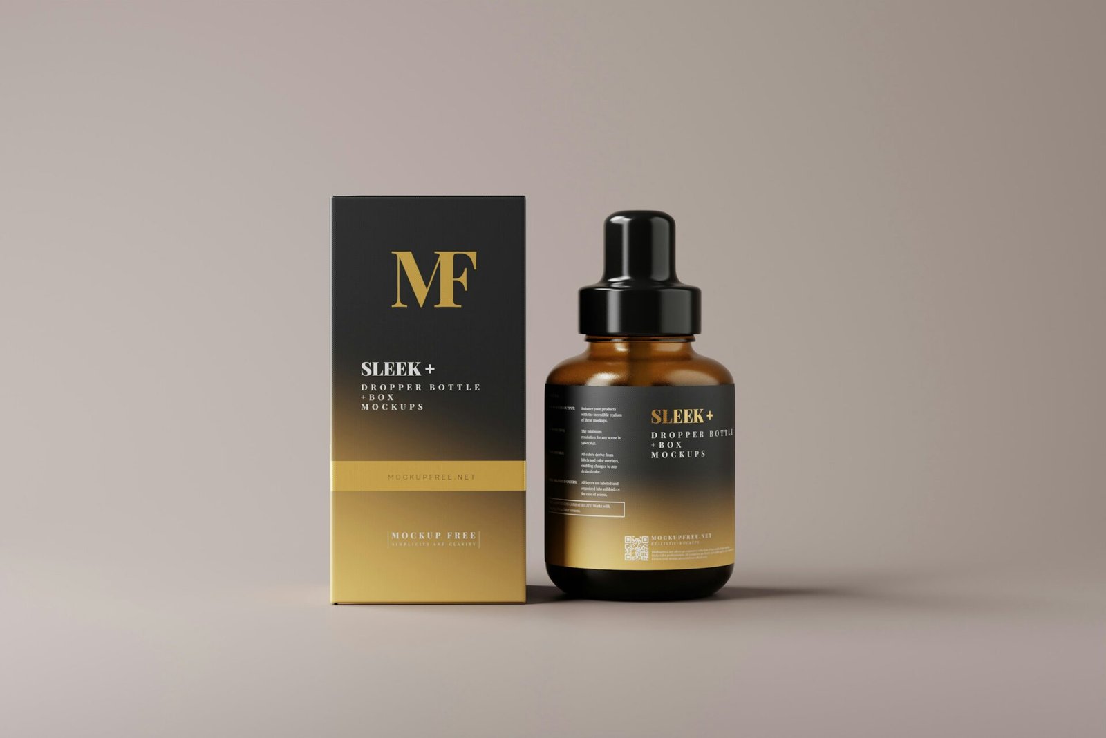
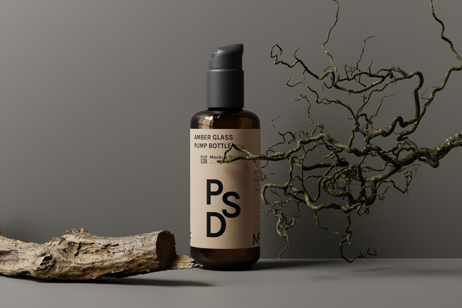
This is default body copy — var(–text-m). Facett is a clean skincare brand inspired by natural elements and architectural form. The objective was to develop a brand identity and packaging system that felt both premium and grounded. This size is set globally by Theme Styles and inherited by all text elements automatically.
var(--text-2xl)
Skincare branding with architectural elegance.
var(--text-xl)
Skincare branding with architectural elegance.
var(--text-l)
Skincare branding with architectural elegance.
var(--text-m) - body default
Skincare branding with architectural elegance.
var(--text-s)
Skincare branding with architectural elegance.
var(--text-xs)
Skincare branding with architectural elegance.
Colour Palette
Colours
var(--color-primary)
var(--color-text-dark)
var(--color-text-link)
var(--color-light-bg)
var(--color-dark-bg)
var(--color-site-bg)
var(--color-border)
var(--color-text-light)
Contextual Spacing
Contextual Spacing within Rich Text and Posts
This is an H2 inside a rich text element
Facett is a clean skincare brand inspired by natural elements and architectural form. The objective was to develop a brand identity and packaging system that felt both premium and grounded. Notice how links are styled with a colour and weight, and how hovering them reveals an underline border bottom transition.
This second paragraph shows the contextual spacing between paragraphs — the gap is set by Theme Styles and applies automatically inside rich text elements, so you never need to add spacing manually here.
This is an H3 inside a rich text element
The gap above this heading is larger than the gap between paragraphs — again, set automatically by contextual spacing in Theme Styles. This is the one place in Bricks where margin-based spacing is correct and expected.
Buttons
Button Styles
Style: Primary
Style: Dark
Style: Dark-Outline
Images & Border Radius